CONTINUITY THROUGH DESIGN
Evolving a historic Italian bicycle marque with restraint, continuity, and a modernist industrial logic. For Italvega, the process of rebranding was not about reinvention but about evolution.
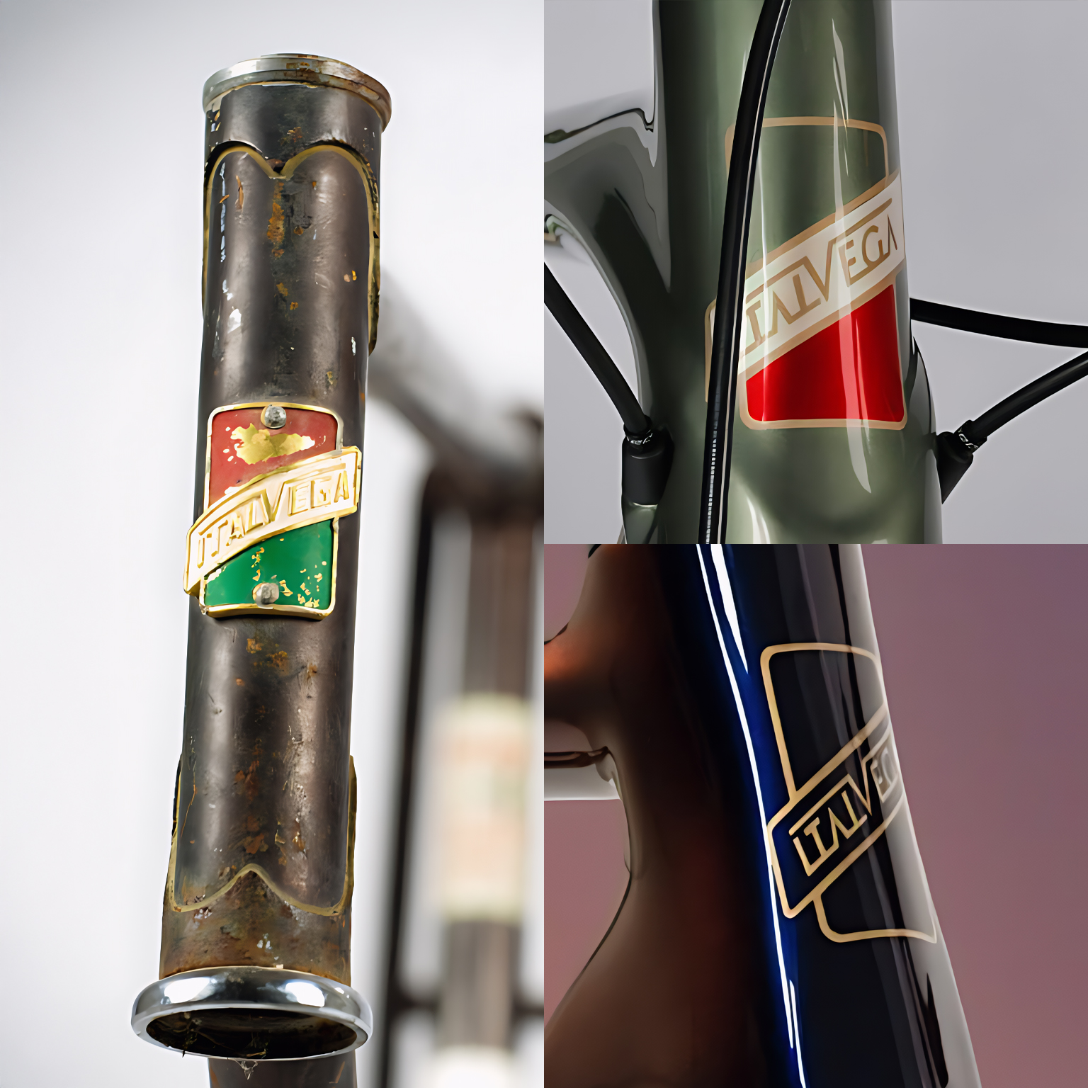
The Italvega brand’s identity is rooted in Italian craftsmanship from the late 1960s and 1970s, a period characterized by industrial clarity, precision, and authority.
The problem here was to modernize the brand while retaining the essence and authority that had been built into its history.
The process started with looking at the logo not in terms of its visual form but rather in terms of its function as an object.
In its history, Italvega‘s logo had functioned in much the same way that any industrial logo would, namely, as a marker of quality on a physical object.
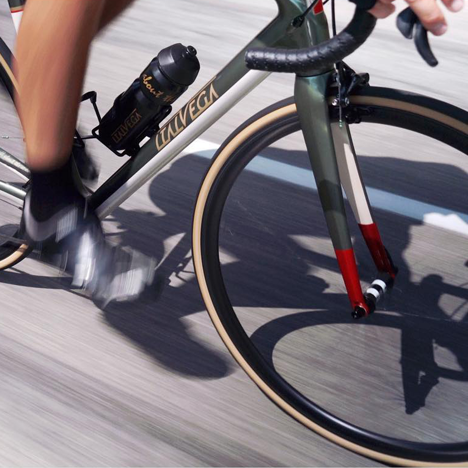
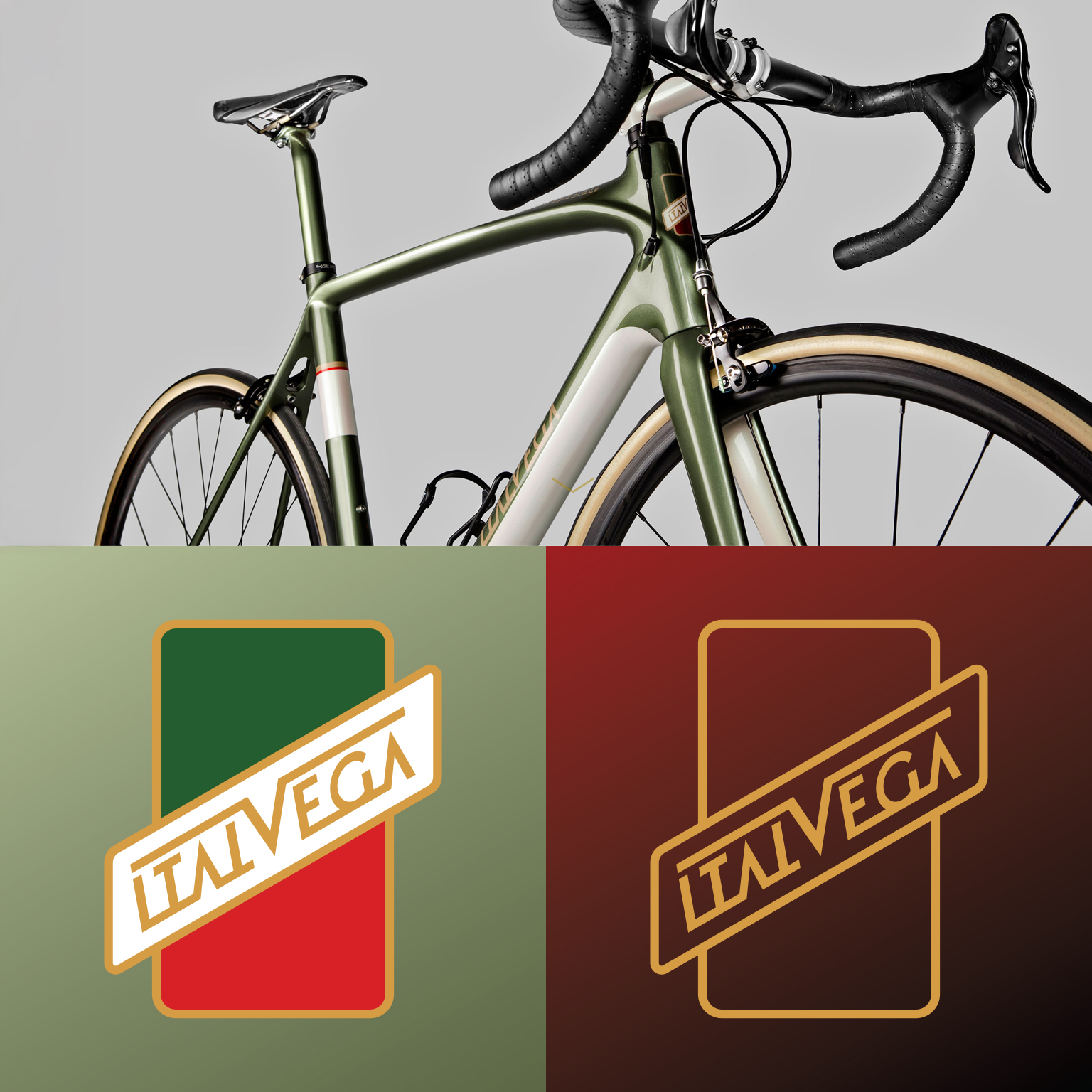
The goal here was to make the brand’s identity feel less like a logo and more like a machine plate, something functional, robust, and purposeful.
The original logo lives in Grafica Industriale Italiana, a form of Italian Rationalist design that emerged in the late 1960s and 1970s.
This school of thought differed from its Swiss equivalent in its emphasis on industrial authority, bold geometry, strong lines, flat colors, and instant legibility on objects rather than in print media.
The rebrand is a translation of this logic in a modern form.
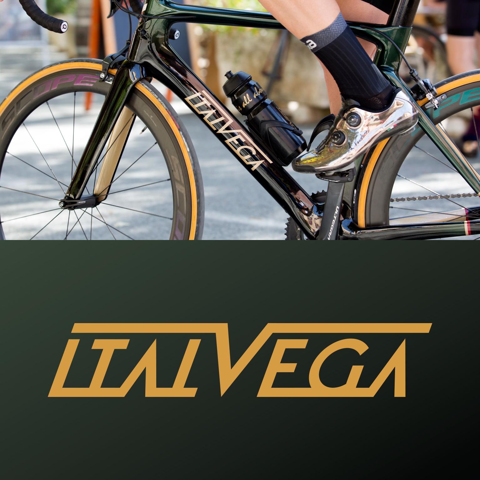
A custom typography-based logo was created with more precise proportions and geometry,
improving upon the industrial structure of the original while still giving it a more modern, precise feel.
The new mark had to be a quality indicator for traditional frames, as well as a simple, modern indicator for modern bikes and apparel.
The rebrand was a partial rebrand in that it built upon existing equities while improving clarity, versatility, and authority.
Rather than focusing attention on the rebrand, I aimed to make the brand feel more complete, more resolved, a process of evolution rather than revolution.
The rebrand is a demonstration of my process for rebranding: progress through continuity.
Understanding a brand’s cultural and physical origins allows for evolution in a way that feels both modern and deeply connected.
Outcome & Impact
The rebrand gave Italvega a new visual foundation that is capable of adapting to both old and new products.
The evolution from recognizability, precision, and versatility has further entrenched Italvega as a brand that is defined by craftsmanship, individuality, and experience, demonstrating that restraint can often be a powerful catalyst for longevity.